Hello! Welcome to your weekly dose of INSPO ✨
You’ve probably heard me talk about the awareness funnel before.
If you haven’t, the idea is to produce ads that speak to people who are in different mindsets when it comes to your product and the problem it solves.
For example, if someone has dry skin even though they moisturise everyday, they might be looking for something other than moisturiser to solve that problem and probably don’t even realise your product exists.
Ad breakdown
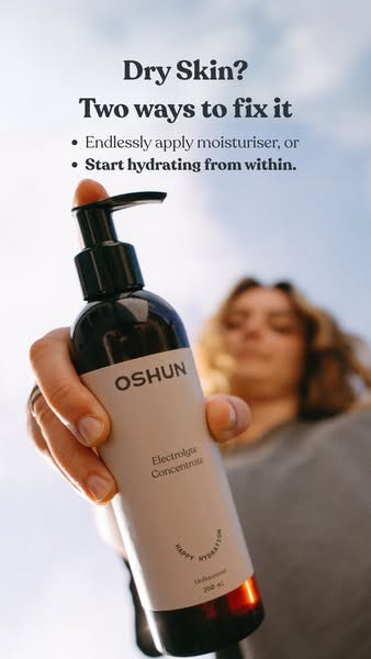
This ad from Oshun is a great example of a problem-aware ad.
The headline states the problem and the rest of the ad goes on to give you a solution.
It speaks to someone who has dry skin but hasn’t solved it yet, they might have been using moisturiser before but it’s not helping, they might be researching ‘how to fix dry skin?’ or ‘why do I have dry skin'?’
The headline grabs their attention, it’s the the rest of the ads job to help them see that this particular product is the right solution for them.
So let’s break it down further…
👉 The headline quickly defines the problem, identifying who the ad is for and why they might be interested in what comes next.
👉 Suggests there are multiple solutions (you’re not being forced into anything here), building trust and relatability rather than being overly pushy with cheesy sales tactics like ‘there’s only one solution’.
This also builds curiosity, why 2 options? Are there only 2? Is there something I don’t know about?
👉 The first option is something anyone with dry skin has tried but when you put it like that doesn’t sound like something anyone wants to be doing. Which makes us think ‘ok I don’t want to do that, what’s the second option?’
As Eugene M. Schwartz tells us in Breakthrough Advertising, the job of each line of an ad is to get your audience to read the next one.
👉 The description of the first option makes the second sound a lot more appealing. Oh and the second is bolded, just in case anyone skips straight there.
👉 The distorted image, shot at an unusual angle puts the product front and centre making it really obvious what it is. This shot also works well as a visual hook breaking the scroll by being something we’re not that used to seeing.
It’s simple, to the point and cleverly worded to position Oshun as the better solution whilst not making it feel like the only option.
How to make this format work for your brand
If you’ve not figured out why people really buy your product yet but you have some reviews and a few hunches about what it solves for people then these ads are a great way to test different messaging angles.
🪩 Choose a problem you know your product can solve
🪩 Highlight other ways of fixing it that you know people have tried but don’t work
🪩 Position yours as the superior option with bold text and strategic language
🪩 Make your product as clear as possible in the visual, don’t make people work hard
🪩 Use a visual that grabs attention, bright colours, odd angles, unusual style
Give this a go and let me know how you get on 💪🏼
Thanks for reading,
Katherine 🪩
Oh and if you liked this email, I’d be grateful if you could pass it on to your team…
Connect with me on LinkedIn


